
GraphicFolks
Prepare a useful visual design handoff
Record color roles, typography choices and a few representative interface examples.
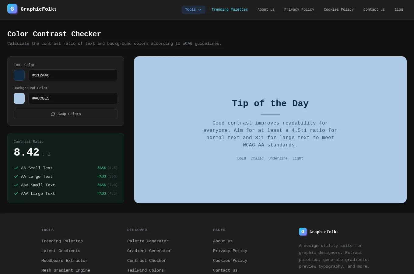
This guide uses GraphicFolks as its starting point. It combines the documented project capabilities with practical suggestions for planning and reviewing your own work. The suggestions below are guidance, not a claim that the application automates every step.
Start with a concrete task
Record color roles, typography choices and a few representative interface examples. Explain how the choices support reading and action.
What the project provides
Explore color combinations and extract palettes for a new visual direction.
Review the result before moving on
A handoff should help someone repeat a decision consistently. Include usage notes instead of delivering only a folder of attractive visual experiments.
Access and setup
Open the live project to explore its current tools and access requirements.
Common questions
Where can I find the current project details?
Read the GraphicFolks project page for its documented features, access notes and live application link.
Does this guide describe an automated workflow?
Only the capabilities explicitly described in the project section are product features. Planning and review suggestions may need to be performed manually.
Your next step
To explore a similar experience for your own audience, review our related service. Start the discussion with a concrete user task and the information needed to complete it.